Pick a ticker. The VIX Sensitivity tool auto-detects today's VIX move and level, finds every historical day VIX behaved the same way, and tells you whether your ticker is outperforming or underperforming what history says it should do, plus the forecast for the next session.
"VIX up 3 points today" doesn't tell you anything by itself. A 3-point pop with the VIX at 14 lives in a totally different world than a 3-point pop with the VIX at 32. The first is a tape twitch on a calm day, the second is a fast accelerator on an already-stressed market. Tickers respond to the combination of where the VIX is and how much it moved, not to either one in isolation.
The right question is: across every prior day where the VIX behaved like it's behaving today, what did this ticker actually do? That's what the VIX Sensitivity tool answers, automatically.
Pick a ticker (SPY, QQQ, IWM, AAPL, NVDA, TSLA, PLTR up front; AMD, AMZN, GLD, GOOGL, META, MSFT, NFLX, SLV in the More dropdown). The tool aligns the ticker's daily candles with VIX daily candles, locks onto the most recent trading day, and reads off the four numbers that drive the comparison.
The Parameters sidebar reads off the latest session's actual VIX action and compares it to historical expectation:
A Tomorrow's Forecast / Today's Forecast toggle at the top of the sidebar flips whether the comparison is anchored on today's move (forecasting tomorrow) or yesterday's completed move (forecasting today's session). Same toggle pattern as the other forecasting tools on the site.
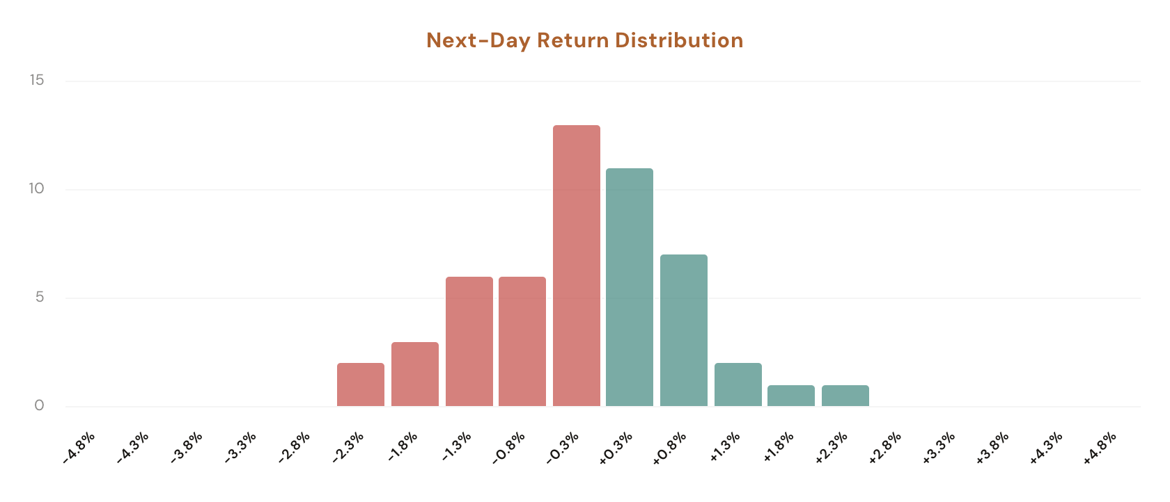
The right side of the page surfaces the conclusion. A header tag reads "TICKER | Outperforming" or "Underperforming" based on the vs Historical math, then a forecast section reports Green Close % (the share of similar historical days that closed higher the next session, with the underlying count like 56.4% (31/55)) and Average Return (the mean close-to-close next-day return on those matching days). Below that, a distribution histogram shows where the next-day returns clustered, and a collapsible Similar Occurrences log lists every historical day that matched today's VIX setup so you can audit whether the average is propped up by one fluke or sits on a stable cluster.
Six surfaces. The sidebar auto-detects today's VIX state; the main panel reports the over or underperforming tag plus the forecast.
The sidebar reads off the most recent close-to-close VIX point change and the prior VIX level automatically. No filters to dial. Pick a ticker, the rest populates from the latest data.
Expected Move is the average historical ticker return on days where VIX moved within ±1 point of today's move AND VIX level was within ±1 point of today's level. Actual Move is what the ticker actually did. The delta gets tagged Outperforming or Underperforming at the top of the main panel.
Switch whether the comparison is anchored on today's still-running move (forecasting tomorrow) or yesterday's completed move (forecasting today's session). Same toggle pattern as the rest of the forecasting tools on the site.
Two numbers off the matching set: the share of similar historical days that closed higher the next session (with the underlying count, e.g. 56.4% (31/55)) and the mean close-to-close next-day return across the same sample.
A column chart showing every matching historical day's next-day return bucketed into bins. See whether outcomes cluster tight around zero, lean continuation, or spread heavy-tailed in both directions.
A collapsible log labelled "X Similar Occurrences" lists every historical day that matched today's VIX setup with date, VIX move, same-day ticker return, and next-day return. Useful for spotting whether the average is one outlier from 2020 or a stable cluster across the whole window.
The build is a single bar-by-bar walk that aligns the chosen ticker's daily candles with VIX daily candles by date.
Most "VIX vs ticker" reads collapse the question to one axis: either "the average return on a +1 VIX day" or "the average return when VIX is above 25." Both miss the conditional structure. A +2 VIX move when the prior level is 12 might fade SPY 0.3%; the same +2 move when the prior level is 32 might cliff-drop 1.1%. Conditioning on both at once is what gives the comparison its bite.
Five workflows that lean on the auto-detected over/underperforming read plus the next-day forecast.
You're long SPY into a VIX pop. Open the tool. Sidebar shows Expected Move −0.5%, Actual −0.1%, vs Historical +0.4%, with the main panel tagged Outperforming. That's a real read: the ticker is shrugging off a move that usually hits it harder. Either size up because the trend is strong, or trim because it's overdue for catch-up. The data tells you which direction the surprise lives in.
An Outperforming tag plus a Green Close near 50% suggests reversion is more likely than continuation; an Underperforming tag with a Green Close above 60% suggests the ticker is set up for a catch-up bounce. The two reads together give you a sizing signal without you having to read tea leaves.
Click through SPY, QQQ, IWM, NVDA, TSLA at the same time. Each ticker's vs Historical reading and Green Close % can differ wildly under the same VIX setup. NVDA might be deeply Underperforming while SPY is mildly Outperforming. Pick the ticker whose response fits the trade you actually want.
If the Average Return looks striking (say +1.5% with 32 occurrences), expand the Similar Occurrences log. Sometimes the average is propped up by one explosive day from 2020 dragging the rest; sometimes it's a stable cluster across the whole window. The log shows you which before you size on it.
The "X Similar Occurrences" count is right there in the log toggle. A 60% Green Close on 12 matches is noise; a 60% Green Close on 250 matches is signal. If today's VIX setup is so unusual that the matching set is small, the forecast is weak and you should size accordingly.
Open the tool, pick a ticker, and read the comparison. Members see the full sidebar (Today's VIX Move, Expected Move, Actual Move, vs Historical), the Tomorrow's / Today's Forecast toggle, the Green Close % and Average Return cards, the next-day distribution chart, and the Similar Occurrences log; free users see the same surfaces blurred behind a sign-up prompt.
Open VIX Sensitivity
Comments
Loading comments…