Study how past spikes played out. How many pullbacks before the top was in? How deep did they go? The answers are in the data.
When a spike is underway, the worst thing you can do is trade it blind. The best thing you can do is study how previous spikes played out. How many pullbacks happened before the top was in? How deep were those pullbacks? How long did the whole cycle last before the price made a new all-time low?
This is homework. And the Spike Analyzer is the tool that makes it possible.
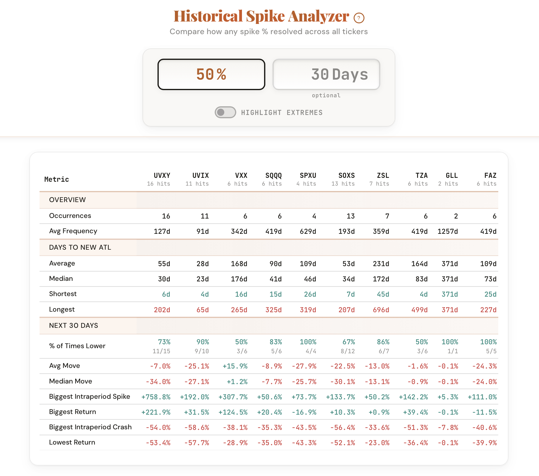
The Spike Analyzer's Cycle Analysis mode lets you step through every historical spike cycle one by one, each displayed on its own interactive candlestick chart. Each cycle is broken down into pullback thresholds: how many 10% pullbacks occurred? How many 20% pullbacks? 30%? 50%? For each one, you see the peak price, the trough, the percentage drop, and how many days it took to recover.
A spike that had three 20% pullbacks before rolling over tells you something very different than one that topped on the first pullback. By studying every past cycle, you start to recognize the rhythm of how these products actually move.
Key patterns to study when reviewing past spike cycles.
Count how many pullbacks occurred at each threshold before the cycle ended. One pullback before the top vs. four pullbacks tells a very different story.
How deep did the pullbacks go? A cycle with shallow 10% dips that keeps rallying is structurally different from one with repeated 30% drops.
How many days from the first spike trigger to a new all-time low? Short cycles fade fast. Long cycles chop and frustrate traders for months.
What was the highest spike percentage in each cycle? This tells you how explosive the product can get and how far above your entry the spike might run.
After the final pullback, how quickly did the product make a new ATL? Fast recoveries mean shorter holding periods for spike trades.
UVXY cycles look different from SOXS cycles. Study both and you'll see why the same entry strategy might need different parameters for each product.
Spike Analysis gives you the aggregate view. Enter a spike percentage and see how it resolved across every ticker: how many times it happened, how long it took to fade, and what the forward returns looked like. This is the birds-eye view of spike behavior.
Cycle Analysis is where the real homework happens. This is the ground-level view: individual cycles on interactive candlestick charts with every pullback mapped and tracked. Click through each cycle and study the structure. The pullback boxes show you exactly where each drop started, how deep it went, and how long it took to recover.
Use Spike Analysis to understand the probabilities. Use Cycle Analysis to understand the texture. Together, they give you the preparation you need before the next spike happens.
Four exercises to do before the next spike happens.
Open Cycle Analysis for UVXY. Click through each completed cycle and count how many 20% pullbacks occurred before the spike topped out. Write down the number for each cycle. You'll start to see a pattern.
For each cycle, note the depth of the final pullback before the product rolled over to a new ATL. Was it 15%? 25%? 40%? Over time, you'll develop a sense of what a terminal pullback looks like for each product.
Run the same exercise on SOXS and compare. Do SOXS spikes have more or fewer pullbacks? Are the pullbacks shallower? Deeper? This tells you whether the same strategy parameters work for both products.
Find the longest cycle and the shortest cycle for each ticker. What made them different? The outliers teach you about worst-case holding periods and best-case quick fades.
Open the Spike Analyzer, switch to Cycle Analysis, and start clicking through past cycles. The patterns are there. You just have to look.
Open the Spike Analyzer
Comments
Loading comments…