Tool Deep Dive
March 15, 2026

When the VIX Moves, How Does Your Stock React?

Our Sensitivity Map answers with historical averages, green/red splits, and forward projections based on similar VIX conditions.

The VIX just moved 3 points. Is that good or bad for your position? The heatmap gives you the big picture, but the Sensitivity Map's detail section tells you exactly what to expect based on historical data.

Click any ticker on the heatmap, and the detail section appears below. It finds every historical day where the VIX was at a similar level and moved in a similar direction, then shows you what the ticker did under those conditions.

Sensitivity Map detail section showing historical VIX sensitivity data

How the Matching Works

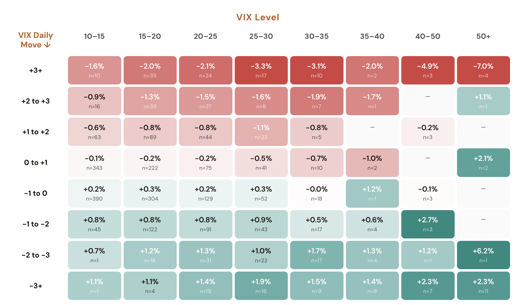
The tool looks at yesterday's VIX closing price and today's VIX move. It then searches the entire history for days where the VIX was within 1 point of yesterday's level and moved within 1 point of today's move. These are your "similar conditions."

For example, if yesterday's VIX closed at 24 and today it moved +3 points, the tool finds every historical day where the VIX was between 23 and 25 and moved between +2 and +4 points. The tighter the filter, the more relevant the matches.

The Top Row: What Happened Historically

The first row of cards gives you four key data points. Today's VIX Move shows the current session's VIX change in points. Similar Conditions shows how many historical days matched the filter. Historical Move shows the average return for your ticker across all those matched days. And Historical Green/Red shows how often the ticker closed positive vs. negative under those conditions.

The last card in the top row shows Today's Actual Move for your ticker, along with whether it's outperforming or underperforming the historical average. This is the key comparison: is today's move in line with what history suggests, or is the ticker deviating from the expected behavior?

The Bottom Row: What Happens Next

The second row answers the forward-looking question. It takes the matched days and splits them into two groups: days where the ticker outperformed the historical average and days where it underperformed. Based on today's actual move, it shows you the relevant group.

Next 1 Day shows the average return on the following trading day. Next 5 Days shows the average return over the next five trading days. Each has a corresponding Green/Red card showing the directional split. If the next-day green percentage is 67%, that means two out of three times, the ticker closed higher the following day under similar conditions.

What Each Card Tells You

Six data points that define the VIX sensitivity edge.

Card

Similar Conditions

The number of historical days that matched the VIX level and move filters. More matches means more statistical reliability. Fewer than 20 matches should be treated with caution.

Card

Historical Move

The average return for the ticker across all matched days. This is your baseline expectation. If the historical average is -0.3%, that's what the ticker typically does when the VIX moves this way from this level.

Card

Historical Green/Red

The percentage of matched days where the ticker closed positive vs. negative. A 60/40 green split tells you the ticker leans bullish under these VIX conditions, regardless of the average return size.

Card

Outperforming/Underperforming

Compares today's actual move to the historical average. If the ticker is outperforming, the forward projections will show what historically happened next when the ticker beat expectations under similar conditions.

Card

Next 1 Day Return

The average return on the very next trading day. This tells you whether the outperformance or underperformance tends to continue or revert. A positive next-day return after underperformance suggests mean reversion.

Card

Next 5 Days Return

The average return over the next five trading days. Captures the medium-term follow-through. Sometimes the next day is flat but the 5-day return is strongly directional, suggesting a delayed reaction.

How to Interpret the Data

Start with the Similar Conditions count. If there are fewer than 15-20 matches, the data is thin and the averages may not be reliable. With 40+ matches, you can have more confidence in the patterns.

Next, check the Historical Green/Red split. This tells you the directional bias regardless of magnitude. A 55/45 split is barely meaningful. A 70/30 split is a strong historical lean.

Then look at the outperforming/underperforming comparison. If your ticker is significantly underperforming the historical average, the forward return cards will tell you whether that underperformance tends to mean-revert (positive next-day return) or continue (negative next-day return).

Finally, compare the Next 1 Day and Next 5 Days returns. If the 1-day return is flat but the 5-day return is strongly positive, the recovery tends to be gradual rather than immediate. If both are positive, the bounce is historically quick and sustained.

Four Ways to Use This

Practical applications of VIX sensitivity data.

1

Check if your position is in line with history

You're long SPY and the VIX just spiked. Open the Sensitivity Map and check the detail section. If the historical average under similar conditions is -0.5% and SPY is only down -0.2%, you're outperforming. The forward projections will tell you if that outperformance tends to hold.

2

Compare sensitivity across tickers

Click through UVXY, SOXS, SPY, and QQQ on the same day. Some tickers are highly sensitive to VIX moves while others barely react. The detail section quantifies this difference with real data instead of assumptions.

3

Use forward projections for trade timing

If the "Next 1 Day" return is historically positive after underperformance, today might be a buying opportunity. If the "Next 5 Days" is negative, the bounce may be short-lived. Let the forward data guide your holding period.

4

Validate your VIX-based thesis

If you believe a VIX spike is bullish for a particular ticker, the Sensitivity Map will tell you if history agrees. The green/red split and average returns under similar conditions either confirm or contradict your assumption with data.

See How Your Ticker Reacts to the VIX

Open the Sensitivity Map and click any ticker on the heatmap. The detail section does the rest.

Open the Sensitivity Map

Comments

Loading comments…