Our Probability Lab shows you the exact green vs red ratio for any ticker across daily, weekly, and monthly timeframes.
Here's a question most traders can't answer: what percentage of trading days is your ticker actually green?
The answer varies more than you'd expect, and it changes depending on the year, the volatility environment, and the ticker itself.
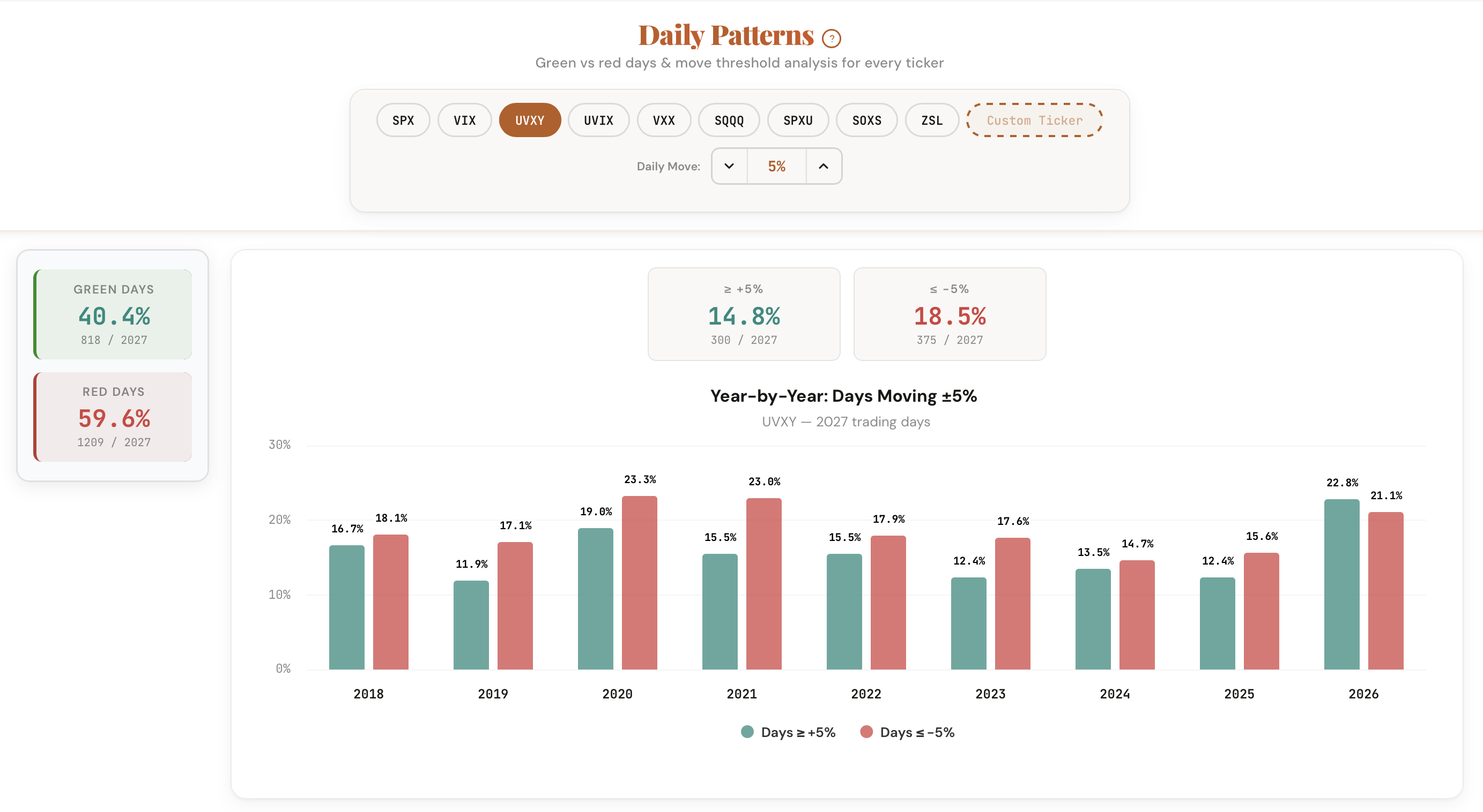
The Probability Lab gives you the complete picture of price behavior for any ticker across daily, weekly, and monthly timeframes. See the percentage of green vs red periods, how often the price moves beyond a threshold you set, and how these patterns have shifted year by year.
Complete return frequency analysis for any ticker, any timeframe.
The exact percentage and count of periods that closed positive vs negative. Works across daily, weekly, and monthly timeframes.
Set a move threshold (1%, 2%, 5%, etc.) and see how often the ticker moves beyond that level in either direction.
Toggle between daily close-to-close, calendar week, and calendar month returns. Different timeframes reveal different patterns for the same ticker.
Isolate results by volatility environment. Move frequencies shift dramatically between calm and elevated markets. The filter quantifies this shift.
A bar chart showing the percentage of periods exceeding your threshold for each year. Spot whether patterns are stable, increasing, or fading.
SPX, AAPL, TSLA, UVXY, QQQ -- built-in presets plus a custom ticker input for any symbol you want to analyze.
The tool calculates the return for every period in a ticker's history. For daily mode, it compares each day's close to the prior day's close. For weekly, it compares Friday's close to the prior Friday's close. For monthly, last trading day to last trading day.
Five ways traders are applying the Probability Lab to their process.
Before selling a weekly put or call, check how often the ticker moves beyond your strike distance in a single week. The weekly mode gives you the exact frequency.
Selling 0DTE SPX options? Check the daily frequency at your strike distance, filtered by the current VIX level. The numbers change dramatically between calm and volatile markets.
Compare move frequencies across tickers at the same threshold. TSLA at 3% daily looks very different from AAPL at 3% daily. Find the ticker that fits your risk tolerance.
Toggle the VIX filter to see how move frequencies shift in different volatility environments. A strategy that works in low VIX might not survive high VIX.
Match the tool's timeframe to your holding period. Daily for day trades. Weekly for swing trades. Monthly for position trades. Same ticker, different frequency profiles.
The Probability Lab is free for every ticker. Enter any symbol, set your threshold, and see the historical frequency across daily, weekly, and monthly timeframes.
Open the Probability Lab
Comments
Loading comments…